JD ASQUARED CASE STUDY
Challenge
DJ ASQUARED was ready to level up his brand presence. As an emerging DJ with a growing following, he needed a logo and brand identity that reflected his dynamic, high-energy sound — while standing out in a crowded music scene.
Approach
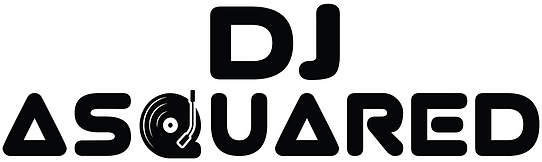
HYPEBRK stepped in to create a bold, sleek brand identity that matched DJ A SQUARED’s vibe. We designed a custom logo that played with symmetry and movement — capturing the duality of “A SQUARED” while staying clean and modern.
Key steps:
-Crafted a logo that balanced minimalism with energy, using geometric lines to reflect his name and musical style
- Developed a cohesive color palette — electric pinks and deep violets — to give his brand a modern, vibrant look
- Selected typography that balanced boldness with readability, perfect for social media, flyers, and stage visuals
- Delivered brand guidelines to ensure consistent usage across all platforms
Results:
DJ A SQUARED now has a strong, recognizable brand identity that reflects his sound and energy:
- The new visuals make it easy for fans to spot his content on social media and event listings
-Increased engagement from followers who instantly connected with the modern, vibrant design
-A confident brand presence that’s ready to expand into merchandise, posters, and beyond.
Brand identity: